
LIVE WELL, LLC
IDENTITY | PRINT | WEB
A logo design, visual identity system, and accompanying brand book for a Seattle-based life coaching company, plus a sub-brand for the owner’s affiliated podcast, Purpose Lounge.
LOGO
The name ‘Live Well’ originates in the names of the owner’s sons—her inspiration for founding a company dedicated to the mental and emotional development of young men and boys: Oliver and Maxwell.
DESIGN
LIVE WELL, LLC
MONOGRAM
Live Well LLC’s primary brand features an all-lowercase, serif logotype, paired with a bold, geometric monogram.


BRAND BOOK
A comprehensive brand book detailing logo usage, color, typography, iconography, and photography ensured all collateral created for the Live Well brand would always look and feel cohesive and consistent.

DESIGN
LIVE WELL, LLC
LOGO
AS PATTERN
The monogram is constructed solely through the repetition of one simple shape: a heart which also functions as a sweet sign-off that maintains a sense of professionalism due to the straightforward geometry of the shape itself.
WORK
CUSTOM
ICONS

DESIGN
LIVE WELL, LLC
BORDERS
The monogram is constructed solely through the repetition of one simple shape: a heart which also functions as a sweet sign-off that maintains a sense of professionalism due to the straightforward geometry of the shape itself.


LIVE WELL, LLC
DESIGN
COLOR
BRAND EXTENSION
The Live Well brand needed a way to visually indicate its suite of coaching offerings, each dedicated to a key area of wellness: relationships, exercise, diet, and spirituality.

DESIGN
LIVE WELL, LLC
EXTENDED PALETTE
The monogram is constructed solely through the repetition of one simple shape: a heart which also functions as a sweet sign-off that maintains a sense of professionalism due to the straightforward geometry of the shape itself.

LIVE WELL, LLC
CATEGORY
PHOTOS
Photography further illustrates the purpose and value of each program in the Live Well catalog.
DESIGN
DESIGN
LIVE WELL, LLC

LIVE WELL, LLC
DESIGN

PURPOSE LOUNGE
The Live Well brand also needed a sub-brand defined for the company’s podcast: Purpose Lounge with Carrie Morris.

DESIGN
PURPOSE LOUNGE
WELCOME
TO THE LOUNGE
Purpose Lounge with Carrie Morris uses the secondary accent color from the broader Live Well color palette as its primary color. This also references the Live Well Relationships coaching program, since the podcast seeks to drive purpose through exploring and creating interpersonal bonds.
LOGO
The Purpose Lounge logo uses the same visual language as the Live Well logo—a repetition of the heart shape that creates a simple, geometric monogram—while the logotype is set in the brand’s secondary typeface: Circular.


PURPOSE LOUNGE
DESIGN
DESIGN
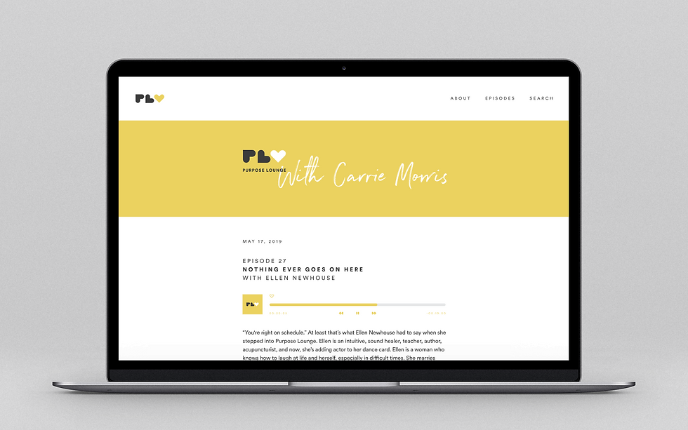
PURPOSE LOUNGE
UI/UX
The Purpose Lounge website functions as a hub for all episodes, plus a town square for listeners to discuss their thoughts in the Purpose Lounge community. The website also features the custom Live Well brand iconography in a bespoke player UI, bringing brand cohesion to even the smallest detail.


